From March to September 2017, the Pear IPM team scouted 19 pear orchards on a weekly basis for pear psylla, mites, and their natural enemies. Orchards were managed conventionally, selectively, or organically, and all were located in the Wenatchee River Valley. This information will be used to create an IPM scorecard based on pest and natural enemy numbers.
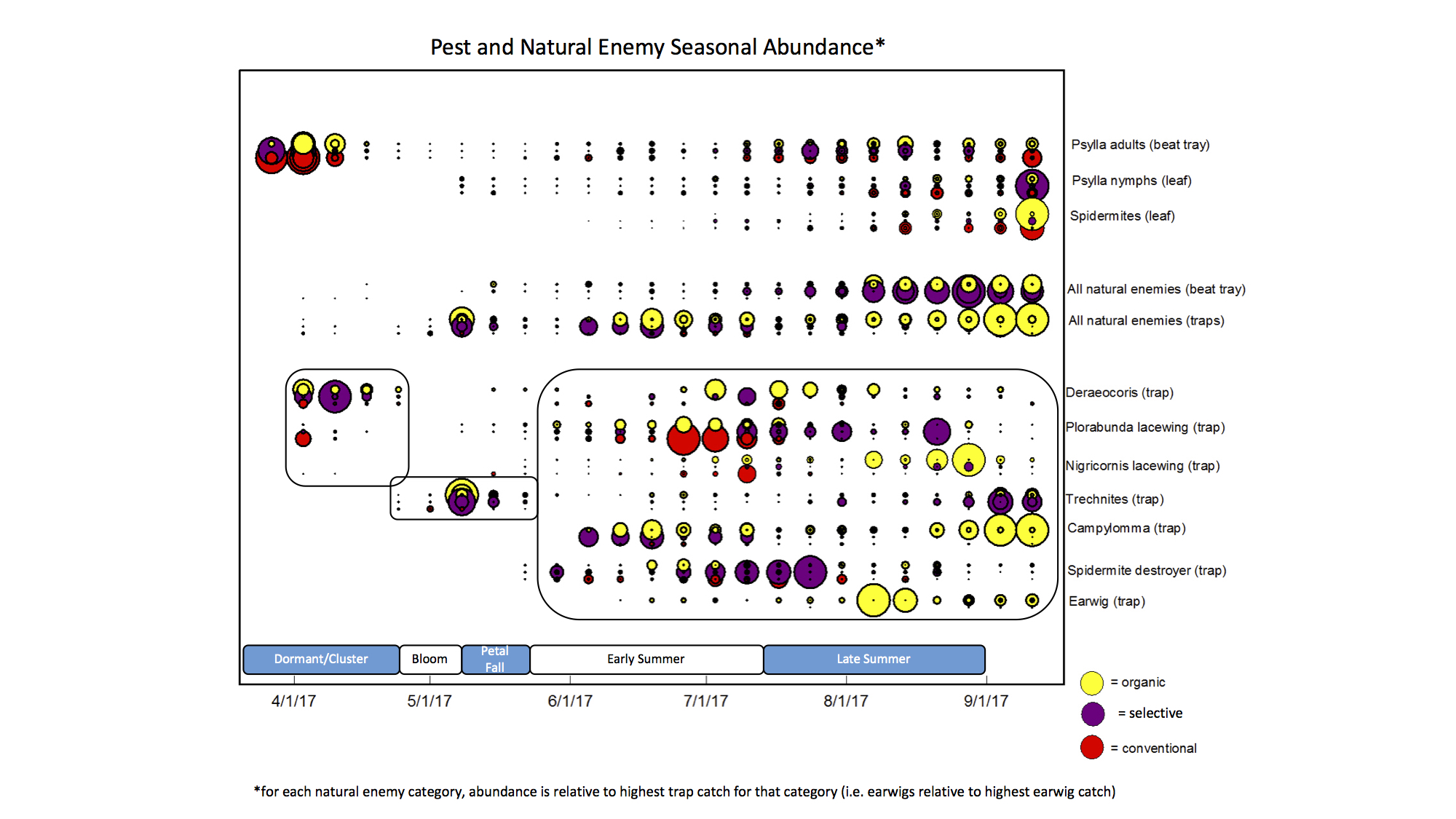
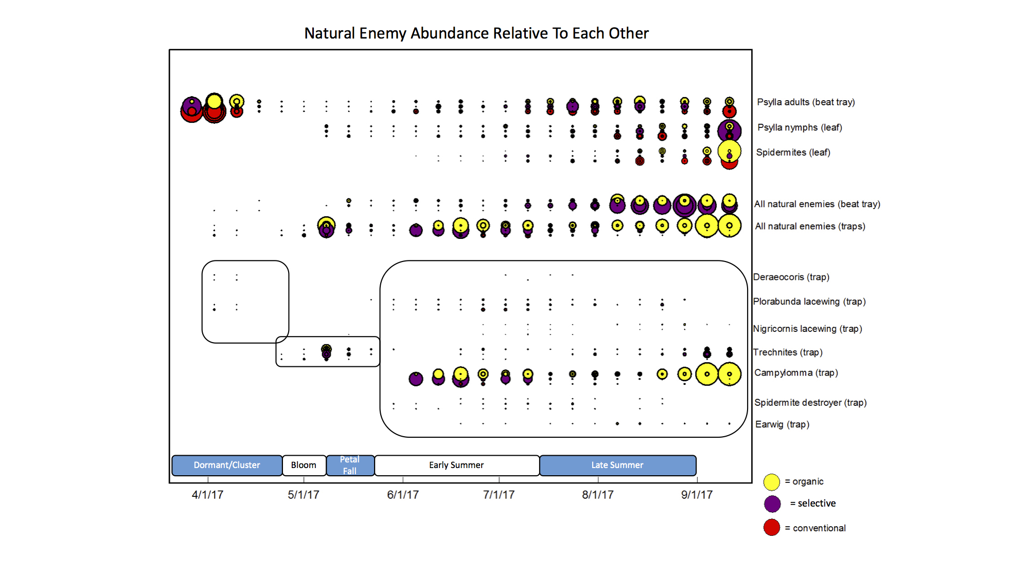
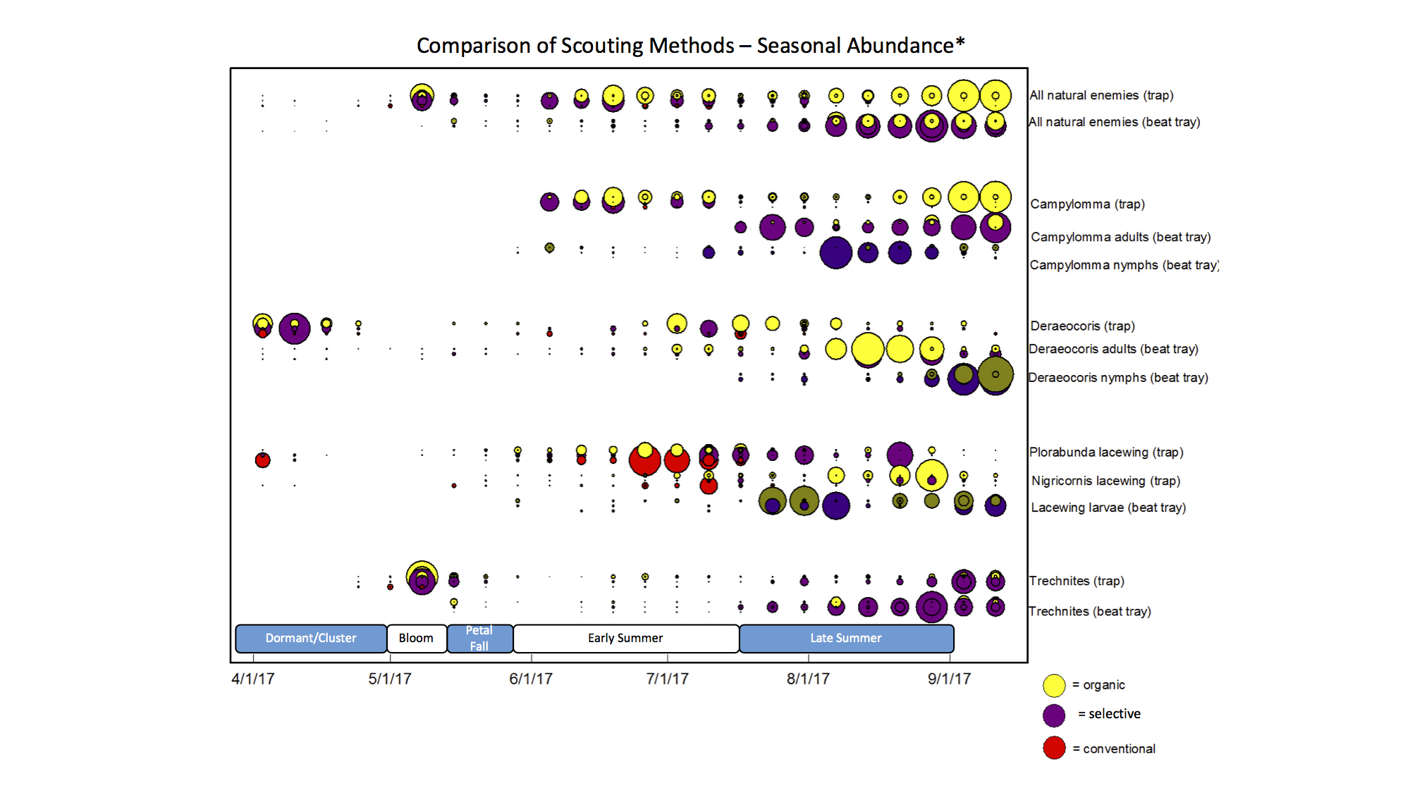
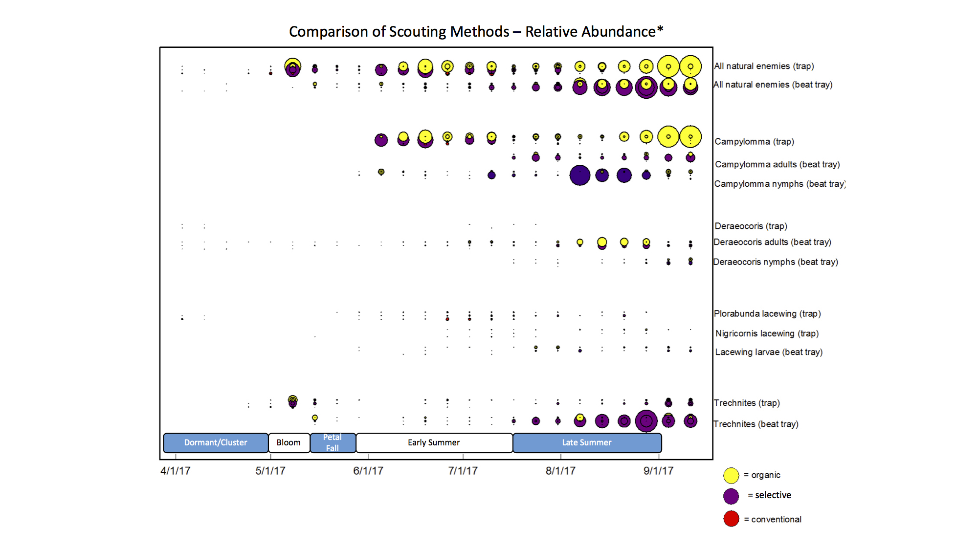
In the plots below, each dot represents abundance of pests or natural enemies at one site from one date.
Plot 1 – Pest and Natural Enemy Seasonal Abundance
The size of the dot is relative to the highest catch average of the season. For example, the highest catch for Campylomma was 115 so the largest dot on the Campylomma line represents 115 and all other dots are relative to this. But for the Nigricornis lacewing the highest average was only 10 and all smaller dots are relative to this.
Plot 3 – Comparison of Scouting Methods – Seasonal Abundance
For the natural enemy categories (Campylomma, Deraeocoris, Lacewings, and Trechnites), the size of the dot is relative to the highest catch average of the season for that species using that scouting method (trap or beat tray).
Plot 4 – Comparison of Scouting Methods – Relative Abundance
For the natural enemy categories (Campylomma, Deraeocoris, Lacewings, and Trechnites) the size of the dot is relative to the highest catch average of the season for any species (115 Campylomma) using that scouting method (trap or beat tray).


